Same Chart, Opposite Conclusions
Last week Anthropic published a report called "Labor market impacts of AI: A new measure and early evidence." The goal was to build a better way to measure how AI is actually affecting jobs. To do that, they introduced a new metric called "observed exposure," which combines a theoretical assessment of what LLMs could do with data on what people are actually using Claude for in professional settings.
The report is careful, methodologically honest, and upfront about the poor track record of past attempts to predict technological displacement. It also contains a chart that has sparked a very different conversation than the one the researchers probably intended.
What the chart shows
The chart overlays two things across occupational categories. A blue area: the share of tasks that an LLM could, in theory, make at least twice as fast. This comes from an earlier study by Eloundou et al. (2023), which assessed each task's theoretical feasibility. A red area: the share of tasks where people are actually using AI in professional work contexts, measured from Anthropic's own usage data.
The gap between the two is large.
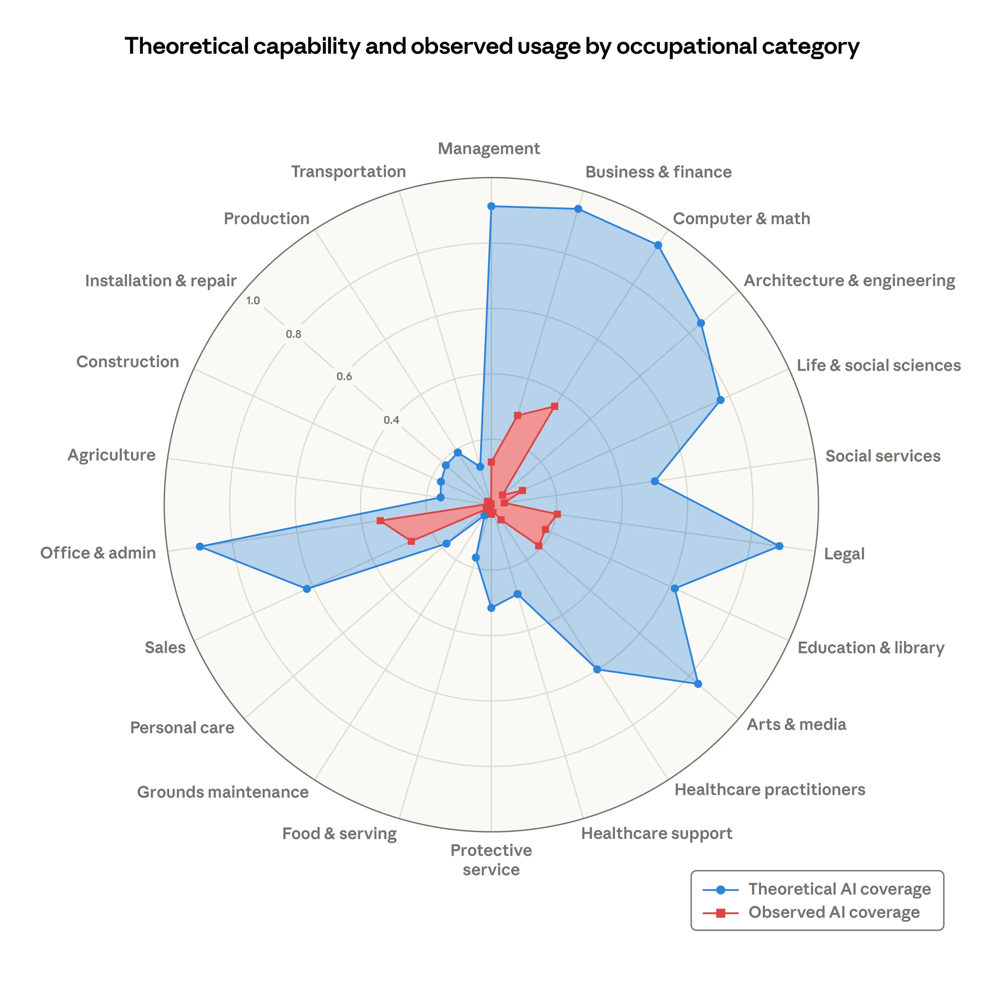 Source: Anthropic, "Labor market impacts of AI: A new measure and early evidence" (2026)
In Computer and Math occupations, the blue covers 94% of tasks. The red covers 33%. Across most categories, the pattern is similar: a large blue area, a much smaller red one inside it.
Two ways to read the same gap
Anthropic's report notes this gap matter-of-factly. They write: "As capabilities advance, adoption spreads, and deployment deepens, the red area will grow to cover the blue." But they also note that "many tasks, of course, remain beyond AI's reach," citing physical work like pruning trees and legal tasks like representing clients in court. Their focus isn't on predicting how fast the gap closes. The report is about measuring labor market displacement, and their main finding is that, so far, there's no systematic increase in unemployment for highly exposed workers (though there are early signs that hiring of younger workers into exposed occupations may be slowing).
Alberto Romero, writing at The Algorithmic Bridge, picks up on the same chart and reads it differently. He characterizes Anthropic's framing as "look how much room there is to grow" and pushes back. To Romero, the gap looks less like a promise and more like a diagnosis. He argues it reveals a serious chasm between what AI can do in theoretical assessments and what it actually delivers in day-to-day work. His critique is that Anthropic's one-sentence nod toward convergence glosses over the mechanism by which it's supposed to happen. As he puts it: they're "handwaving too much the process by which the red area will become as big as the blue, asserting that it will."
Same chart. Two readings. Anthropic sees the red growing over time. Romero asks: what if the size of the blue tells us more about AI's current limits than its future trajectory?
Why this is worth paying attention to
Neither Anthropic nor Romero is writing about enterprise AI purchasing decisions. Anthropic is studying labor markets. Romero is questioning the AI industry's assumptions. But the gap they're both pointing to has a parallel that shows up inside organizations every day.
The theoretical feasibility of AI (what it could do to a given set of tasks) is one thing. The practical reality of AI inside a specific company (what it's actually doing) is often something very different. And the distance between the two is where a lot of money gets spent without much clarity on what's coming back.
Companies make AI investment decisions based on what tools can do in demos, in pilots, in controlled conditions. But once those tools hit production, there tends to be very little visibility into what's actually happening. How many tasks are being completed faster? How much human time is actually being freed up? Is the spend translating into output, or just into activity?
The Anthropic chart is macro-level. It shows the aggregate gap across entire occupational categories. But a version of the same gap exists at the company level, and it varies widely by team, by use case, by how deeply AI is embedded into workflows versus bolted on as an afterthought.
From macro gap to company-level signal
Some organizations seem to be genuinely closing the gap between what AI could do and what it's actually doing for them. Their spend translates into measurable output: faster cycle times, fewer hours on automatable tasks, clear productivity gains. Others are spending at similar rates and seeing a fraction of the return.
The difference doesn't appear to be the AI itself. It seems to be implementation, adoption, and whether anyone is tracking the delta.
Right now, the industry's approach to AI measurement looks a lot like evaluating a marketing campaign by how many ads you bought rather than what they converted. Input metrics (seats purchased, models deployed, API calls made) are everywhere. Output metrics (did the work actually get better, faster, cheaper?) are surprisingly rare.
What this means for AI buyers
Regardless of whether the macro gap between theoretical feasibility and real-world usage closes over time or turns out to be more structural, the companies that can see their own version of that gap will make better decisions than the ones that can't.
If usage is catching up to capability, measurement tells you whether you're keeping pace. If the gap turns out to be stickier than expected, measurement shows you where to reallocate before spending runs ahead of results.
Ready to measure your AI impact?
See where your organisation leads and lags — with a scored report your board can act on.
Book a 20-Minute Discovery Call